What’s in a logo?
I’m sure you know what a logo is, but it’s worth taking a moment to consider its meaning in the context of an indie game. A logo is an identity, just like yours — a name and a face. It’s often the first thing that potential players will see when they spot your game in the store, so your logo is an important factor that can have a big impact on your game’s chances for success.
Game logos have a unique consideration: they are often displayed as very small thumbnails on digital storefronts like Steam or itch.io, surrounded by dozens or even hundreds of other logos. For this reason, it is essential that the logo is both readable and eye-catching, even at a very small size. It must stand out even in a crowded, visually noisy environment.
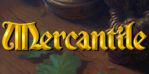
To create a logo that is legible even when displayed at really small sizes (like the key art on Steam, for instance) I decided to go with what is known as a “wordmark” — a text only logo. This ensures that I can maximize the size of the text within any thumbnail, improving readability.
Step 1: Inspiration
What inspired you to create your game? As the saying goes, “there is nothing new under the sun” — we are all inspired by what came before us. In the case of Mercantile, I am particularly inspired by the aesthetic of the many great PC games of the 1990s.
If your inspirations aren’t clearly defined, it’s worth your while to take a few moments and write down the specific details. This will help you distill down what it is about each piece of inspiration that is compelling to you. This will of course help you when designing the logo, but it will be beneficial to your game’s entire development process as well.
Once you’ve identified your inspirations, it’s time for the “big idea”. What sort of feeling do you want your game to evoke, when someone sees it in the store for the first time? What might catch someone’s attention and make them think, “this is the game for me”? You need to figure out the vibe. In graphic designer speak, this is known as the concept.
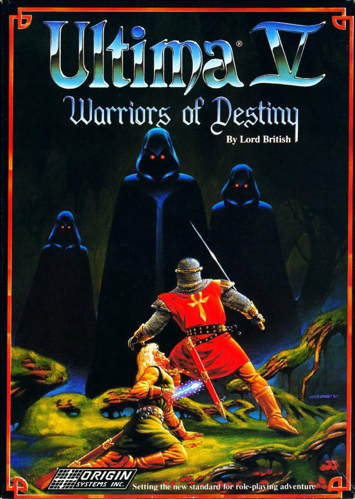
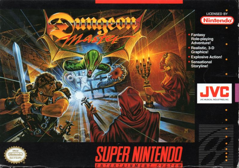
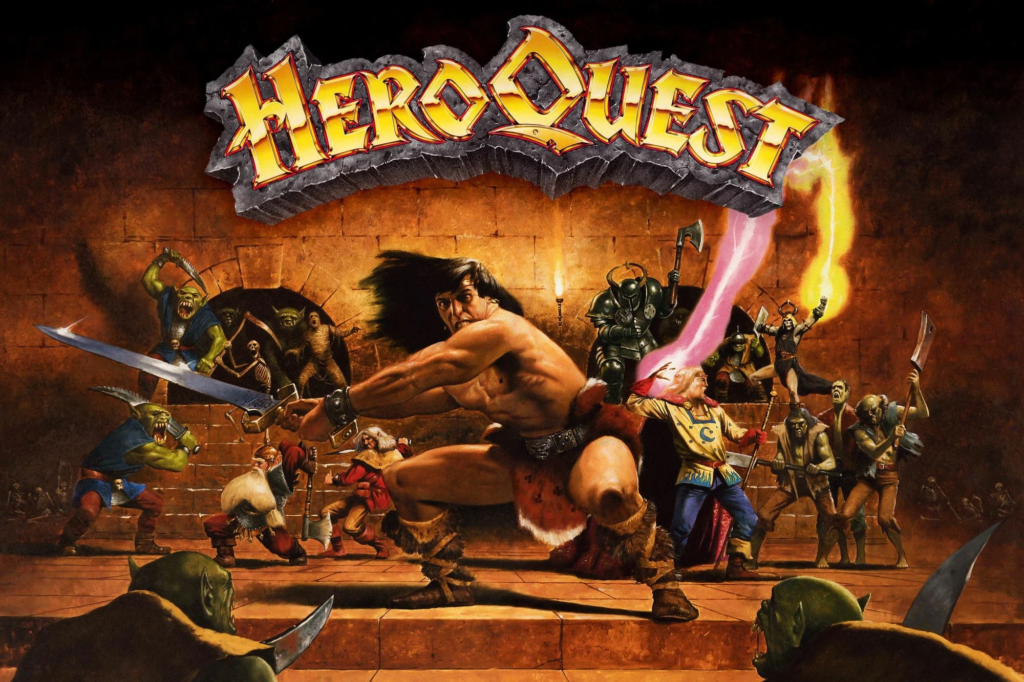
Once you’ve got the concept nailed down, it’s a lot easier to see what parts of your inspirations will point you towards that vibe. For me, this meant looking at game logos and box art from those beloved 90s games. Since Mercantile is going to take place in a medieval setting, I could specifically focus on 90s fantasy games.
Go and collect some images of these specific inspirations — it’s handy to have something concrete to refer to, rather than just your memory. It’s useful to be able to look at a piece of inspiration and see “that’s how it was” rather than “I think that it was kind of like this”.
Google Images or similar is fine for this step — you don’t need to worry about copyright, since these images are for your personal use only and you won’t be using any parts of these images directly. Remember the wisdom of Pablo Picasso: “Good artists copy, great artists steal”
I knew roughly what I was looking for: a serif or calligraphic font, big beefy bezels and a juicy metallic sheen, for that perfect retro vibe. Here are some of the images I ended up pulling:
Now we have a better idea of what we’re aiming for. On to the next step!
Step 2: Roughs
Depending on what you’re going for with your logo, it’s very likely that you’ll be doing sketches in this step. The goal with these first rough sketches is to get your ideas out as quickly as possible, so I recommend using pencil and paper for these — the imprecise nature of your tools will prevent you from getting bogged down in little details, which are unnecessary right now.
Try to give your brain a bit of a workout here. The first couple ideas you put down are usually the obvious ones, and you can often come up with more unique and interesting ideas if you force yourself to get creative. With that being said, it does sometimes happen that one of your first ideas ends up being the best one, and that’s okay!
For Mercantile, since I planned on going with a simple wordmark instead of a symbol or more complicated illustrated logo, I actually skipped the sketch stage and went looking for fonts instead. I collected a few different fonts I liked the look of from Dafont, and created a mood board so I could easily compare them.
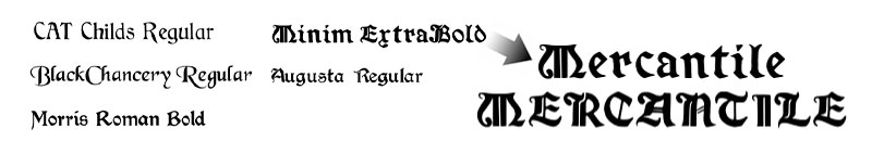
NOTE: For anyone out there wanting to use calligraphic “Old English” style fonts in their logos — all caps is usually a bad idea (see above). These typefaces were not designed to be used with all caps, the capital letters are usually very ornate, which become very difficult to read when used one after another. Stick to title case for these types of fonts!
Again, at this stage I wasn’t worrying about copyright or licenses, because I knew I wanted to draw something unique for Mercantile in the end, so the fonts served as inspiration and were not used directly. If you do end up finding a perfect font you want to use for your logo, please ensure you are legally allowed to do so, and save yourself from potential trouble in the future. If a free font requires attribution, do the right thing and put the author in your game’s credits.
Step 3: Silhouette
When designing any logo, it’s a good idea to keep the silhouette in mind. This is the basic outline of the logo, if you removed everything else or turned everything black. The best logos are usually recognizable from the silhouette alone. A strong, unique silhouette will allow your logo to be recognized and understood from a split-second glance, even before your brain has a chance to actually read the text!
For Mercantile, I liked the overall vibe and shapes of the font “Minim Extra Bold” but when looking at it more closely, the letters were a bit “blobby” and I wanted something sharper and more refined. I also knew that I’d be converting it to pixel art as a final step, so straighter lines would make my life much easier at that stage.
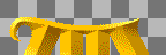
But look at that “M”! What a great shape, very unique and iconic. The “M” does most of the heavy lifting when it comes to the Mercantile logo silhouette. I thought it would also work great by itself as an icon for the game.
I began creating the final letterforms as black shapes on a plain white background. I recommend you do this in a vector illustration program if possible, such as Adobe Illustrator or perhaps Inkscape. Yes, even if it’s going to be pixel art in the end! Vector illustrations are much more flexible in terms of resizing and printing, and they make it much easier to make changes down the road if necessary.
If you are going to be making your logo into pixel art when all is said and done, make things easier on yourself with these tips:
- If possible, figure out the pixel size that the logo needs to be in your game, and make your vector illustration document that same size.
- If you’re using Illustrator, turn on “Snap to Pixel”. If you’re using Inkscape, make a 1 pixel by 1 pixel grid and then turn on “Snap to Grid”.
Step 4: Final Illustration
Now that I had a nice clean black-and-white vector drawing of my logo, it is time to “juice it” and add some bevels. While there are bevel functions in many design programs, it has been my experience that if you really want good results for vector bevels, you’ve got to draw them by hand (sorry). Time to knuckle down and get it done!
A Couple of Design Tips:
- Lighting: If your logo has bevels like mine, keep in mind the direction of the (imaginary) light as you draw and shade. Remember that the lightest areas will be those directly facing the light source, areas that are perpendicular to the light source will have a medium tone, and only the areas facing directly away from the light will be the darkest areas. It may be helpful to create a colour palette of shaded hues to keep things consistent as you work. If you want your logo to have a metallic look, you’ll have shorter transitions between these shades, and possibly even some lighter areas in your shaded parts from reflected light. When in doubt, look back at your reference images and/or go find some more.
- Non-Destructive Editing (NDE): this is a useful strategy employed in the design and photography worlds for reducing future headaches. It’s similar to the idea of “encapsulation” in programming. Basically, you want to be able to change parts of your design without having to redo other dependent pieces. For instance, having a drop shadow on your logo is better done with a “Stylize” effect in Illustrator, or using a Layer Style in Photoshop. This way, if you need to tweak one of the shapes in your logo, the shadow will automatically update to match. And if you decide later to nix the shadow altogether, it’s as easy as unchecking a checkbox.
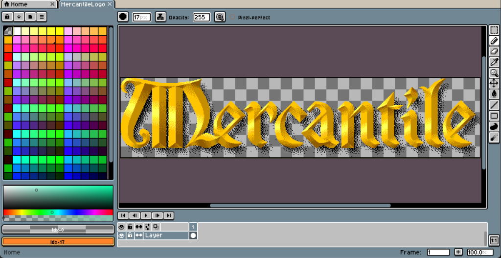
Step 5: Conversion to Pixel Art
Now that I’ve got the vector version of the logo finished, the next stage is the conversion to pixel art. There are a number of different programs that can do this, almost any program that can resize images can work for this step. However, there are a few standout tools that will make your life easier. I had a number of people recommend Aseprite to me for pixel art, and they were spot on. It’s a great tool that has some very handy features that make working with pixel art much easier.
Export the logo as a transparent PNG. PNG is lossless by default so your filesize will be a bit bigger, but you won’t have to deal with ugly compression artifacts when you import it into your game.
Again, you’ll want to know what pixel size your logo will be. I know that I want the logo on my game’s title screen to be 503 pixels wide and 111 pixels high (including shadow). I’m not too worried about resizing it from there for Steam artwork or whatever, if it’s resampled for those I am okay with that. So I’ll just worry about the title screen size. If your logo is going to show up anywhere else in your game, you may want to make additional versions at those sizes so the resolutions match up with the rest of your assets.
Another VERY important factor is, you’ll want to figure out what your colour palette will be. This is absolutely crucial in getting it to look “right” in the end. In my case, since I want to emulate software from the Windows 95/98 era, I chose a 256 colour 8-bit palette like so.
Step-by-Step
- Open the exported PNG in your pixel editor (again I’m using Aseprite so the following steps may vary a little if you’re using a different program). It will most likely come in as “normal” RGBA, so you’ll have the exact colours that you exported as.
- Load your colour palette. Aseprite comes with a bunch of different palettes that match different retro hardware/software platforms, so I was able to find my 256 colour palette in there. You may need to download a palette for your program, or create your own from a reference image.
- Switch the image’s colour mode from “RGB” to “Indexed”. In Aseprite this is in the “Sprite > Color Mode” menu. This will convert your image to use the specific colours from your palette. If possible, experiment with the dithering options to find the result that looks best to you. In Aseprite, this is done by selecting “Sprite > Color Mode > More Options” which will let you preview different dithering algorithms before applying the conversion.
- Ensure you have one of your colours from your palette set to be your “transparent” colour. In Aseprite this can be set from the “Sprite > Properties” dialog. This should be a colour that you’re not using elsewhere in your logo. For mine I chose a bright magenta colour that didn’t interfere with the shades of yellow/gold/brown from my logo.
- You’re done! (Almost)
It’s very likely that you’ll need to do some manual cleanup at this stage. Going from a smooth RGB colour mode to a more limited palette is bound to create some jagged edges and less than perfect gradients, even with a solid dithering algorithm. So you’ll have to zoom in and take care of those issues by hand.
If you have a lot of gradients in your logo, you might find that this method of conversion doesn’t quite give you the results you want. In that case, it may be a better option to export your logo with flat colours, and then rebuild the gradients in whatever pixel art program you’re using. Aseprite has phenomenal dithered gradient tools for this purpose.
Job Done!
Now all that’s left to do is export your finished pixel art image as a new PNG, and import it into your game engine of choice. Huzzah!
Hopefully this article sheds some light on the logo development process and how to get the most out of it. I know a lot of indie developers come from a programming background, and struggle with the art and design aspects of game development. This is one of my strong points, and I hope that by sharing my expertise, it can benefit you when you’re looking to create the logo for your next indie game.
Please leave a comment if you have any questions, or get in touch with me via social networks or email. I’m happy to strike up a discussion on this topic!
Leave a Reply to Spencer Goldade Cancel reply